Elix v2.0 released with support for extensively customizable components


Two months after releasing version 1.0 of Elix, we're happy to announce version 2.0.
The main focus of this release is a new paradigm for customizing components in which complex component can expose internal elements as configurable properties. You can control the appearance and behavior of such a complex component by handing it other components it will use internally to fill various roles.
This paradigm lets us unify components that had previously been distinct, implementing them with reusable, shared code. For example, by default the Elix Carousel shows little dots along the bottom:

We can override those dots and tell the carousel component to use thumbnails for that role instead, producing a new CarouselWithThumbnails component:

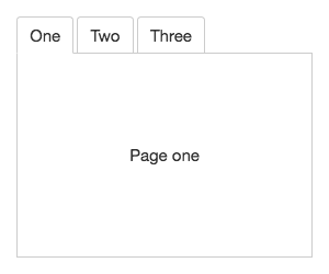
As another example, the Elix Tabs supplies a default style with a classic rounded tab look:

It's easy enough to supply a custom button to fill that same tab button role, as in this Tabs instance used as the organizing navigation element in a mobile app:

If you click the image through to the live demo, you'll see that the main "stage" element for this navigation UI has also been changed. Tabs has a main stage that shows a single tab panel at a time. By default, Tabs uses a simple Modes component as its stage. But this stage can be replaced with another element like SlidingStage, which not only adds a sliding transition, but also support for touch/trackpad gestures to move between tabs.
That's a level of customization far beyond what's feasible in CSS. By using one custom element as a parameter to another, we can efficiently create different expressions of fundamental UI patterns.
But as we built Elix 2.0, we realized we could take this idea of customization through custom elements as parameters a lot further.
When viewed at the right level of abstraction, all of the component examples shown above are the same component. These carousels and tabbed UIs don't look alike, but at a logical level, these UI patterns both share core behavior:
All of those parts — the stage, the list of proxy elements, the proxy elements themselves — are configurable via properties.
By separating logical roles and relationships from particular DOM representations, we can find new opportunties to efficiently reuse code. Elix 2.0 delivers the shared behavior for the UI patterns above in a new component called Explorer. That can be configured on a per-element basis, or subclassed to bake the customizations in, as with the component classes showcased above.
We've applied the same configuration paradigm to the Elix set of overlay elements, so that Dialog, Drawer, and Popup are all built around a configurable Overlay core. We expect we'll find opportunities to use this same pattern in many other places.
Building components around extensively configurable components like this means we can handle subtleties like accessibility and keyboard support in a consistent way, allowing us to deliver a higher-quality and more usable result. It also means that you can readily adapt Elix components for the unique needs of your application, including extensive possibilities for branding.
Read the full release notes for Elix 2.0.