
Overview
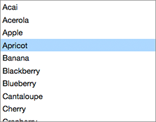
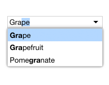
ListWithSearch pairs an in-place text input element with a FilterListBox to filter choices as you type.
ListWithSearch keeps the keyboard focus on the input element, even when the user interacts with the list box, so that the user can always type at any point.
Usage
import ListWithSearch from 'elix/define/ListWithSearch.js';
const listWithSearch = new ListWithSearch(); // or
const listWithSearch = document.createElement('elix-list-with-search');
In HTML:
<script type="module" src="node_modules/elix/define/ListWithSearch.js"></script>
<elix-list-with-search>
  <!-- List items go here -->
</elix-list-with-search>
Use ListWithSearch when:
- The set of choices is very large.
- You have sufficient room. If space is constrained, consider a FilterComboBox.
See also
API
Class hierarchy:
The element defines the following shadow parts:
-
input: the input element for search terms, default type is AutoCompleteInput -
list: the searchable list of items, default type is FilterListBox
booleanname, value) static method
Given a string value for a named boolean attribute, return true if the
value is either: a) the empty string, or b) a case-insensitive match for the
name.
This is native HTML behavior; see the MDN documentation on boolean attributes for the reasoning.
Given a null value, this return false.
Given a boolean value, this return the value as is.
Parameters:
- name:
string– - value:
string|boolean|null–
Defined by AttributeMarshallingMixin
current
currentindexchange event
Raised when the currentIndex property changes.
Defined by CursorAPIMixin
current
current
True if the list should always have a current item (if it has items).
Type: boolean
Default: false
Defined by CursorAPIMixin
cursor
True if cursor operations wrap from last to first, and vice versa.
Type: boolean
Default: false
Defined by CursorAPIMixin
default
The default state for the component. This can be extended by mixins and classes to provide additional default state.
Type: PlainObject
Defined by ReactiveMixin
delegates
Returns true if the component is delegating its focus.
A component using DelegateFocusMixin will always have this property be
true unless a class takes measures to override it.
Type: boolean
Default: true
Defined by DelegateFocusMixin
filter property
A text filter applied to the list's items. Only content elements whose
text contains the indicated filter text will be included in the list's
items property. The text search is case insensitive.
By default, the filter is empty, so all substantive content elements
are included in items.
Type: string
go) method
Moves to the first item in the list.
Returns: Boolean True if the current item changed, false if not.
Defined by CursorAPIMixin
go) method
Move to the last item in the list.
Returns: Boolean True if the current item changed
Defined by CursorAPIMixin
go) method
Move to the next item in the list.
If the list has no current item, the first item will become current.
Returns: Boolean True if the current item changed
Defined by CursorAPIMixin
go) method
Moves to the previous item in the list.
If the list has no current item, the last item will become current.
Returns: Boolean True if the current item changed
Defined by CursorAPIMixin
ids property
A convenient shortcut for looking up an element by ID in the component's Shadow DOM subtree.
Example: if component's template contains a shadow element <button id="foo">, you can use the reference this[ids].foo to obtain
the corresponding button in the component instance's shadow tree. The
ids property is simply a shorthand for getElementById, so
this[ids].foo is the same as
this[shadowRoot].getElementById('foo').
Type: object
Defined by ShadowTemplateMixin
input
The class or tag used to create the input part - the input
element in which the user can enter search text.
Type: (component class constructor)|HTMLTemplateElement|string
Default: 'input'
items property
The current set of items drawn from the element's current state.
Defined by DelegateItemsMixin
keydown() method
See the symbols documentation for details.
Defined by KeyboardMixin
list
The class or tag used to create the list part - the region
that presents the available set of items matching the search criteria.
Type: (component class constructor)|HTMLTemplateElement|string
Default: ListBox
render(changed) method
Render the indicated changes in state to the DOM.
The default implementation of this method does nothing. Override this method in your component to update your component's host element and any shadow elements to reflect the component's new state. See the rendering example.
Be sure to call super in your method implementation so that your
component's base classes and mixins have a chance to perform their own
render work.
Parameters:
- changed:
ChangedFlags– dictionary of flags indicating which state members have changed since the last render
Defined by ReactiveMixin
render) method
Render any pending component changes to the DOM.
This method does nothing if the state has not changed since the last render call.
ReactiveMixin will invoke this method following a setState call;
you should not need to invoke this method yourself.
This method invokes the internal render method, then invokes the
rendered method.
Defined by ReactiveMixin
rendered(changed) method
Perform any work that must happen after state changes have been rendered to the DOM.
The default implementation of this method does nothing. Override this
method in your component to perform work that requires the component to
be fully rendered, such as setting focus on a shadow element or
inspecting the computed style of an element. If such work should result
in a change in component state, you can safely call setState during the
rendered method.
Be sure to call super in your method implementation so that your
component's base classes and mixins have a chance to perform their own
post-render work.
Parameters:
- changed:
ChangedFlags–
Defined by ReactiveMixin
select() method
Selects all the text.
See the standard select documentation for details.
Defined by DelegateInputSelectionMixin
selected
The index of the selected item, or -1 if no item is selected.
Type: number
Defined by SingleSelectAPIMixin
selectedindexchange event
Raised when the selectedIndex property changes.
Defined by SingleSelectAPIMixin
selected
selection
The end index of the selected text.
See the standard input element documentation for details.
Defined by DelegateInputSelectionMixin
selection
The beginning index of the selected text.
See the standard input element documentation for details.
Defined by DelegateInputSelectionMixin
set) method
Replaces a range of text.
See the standard setRangeText documentation for details.
Defined by DelegateInputSelectionMixin
set) method
Sets the start and end positions of the current text selection.
See the standard setSelectionRange documentation for details.
Defined by DelegateInputSelectionMixin
setchanges) method
Update the component's state by merging the specified changes on top of the existing state. If the component is connected to the document, and the new state has changed, this returns a promise to asynchronously render the component. Otherwise, this returns a resolved promise.
Parameters:
- changes:
PlainObject– the changes to apply to the element's state
Returns: Promise - resolves when the new state has been rendered
Defined by ReactiveMixin
state property
The component's current state.
The returned state object is immutable. To update it, invoke
internal.setState.
It's extremely useful to be able to inspect component state while
debugging. If you append ?elixdebug=true to a page's URL, then
ReactiveMixin will conditionally expose a public state property that
returns the component's state. You can then access the state in your
browser's debug console.
Type: PlainObject
Defined by ReactiveMixin
statestate, changed) method
Ask the component whether a state with a set of recently-changed fields implies that additional second-order changes should be applied to that state to make it consistent.
This method is invoked during a call to internal.setState to give all
of a component's mixins and classes a chance to respond to changes in
state. If one mixin/class updates state that it controls, another
mixin/class may want to respond by updating some other state member that
it controls.
This method should return a dictionary of changes that should be applied
to the state. If the dictionary object is not empty, the
internal.setState method will apply the changes to the state, and
invoke this stateEffects method again to determine whether there are
any third-order effects that should be applied. This process repeats
until all mixins/classes report that they have no additional changes to
make.
See an example of how ReactiveMixin invokes the stateEffects to
ensure state consistency.
Parameters:
- state:
PlainObject– a proposal for a new state - changed:
ChangedFlags– the set of fields changed in this latest proposal for the new state
Returns: PlainObject
Defined by ReactiveMixin